This article was published also on CodeProject.com.
Introduction
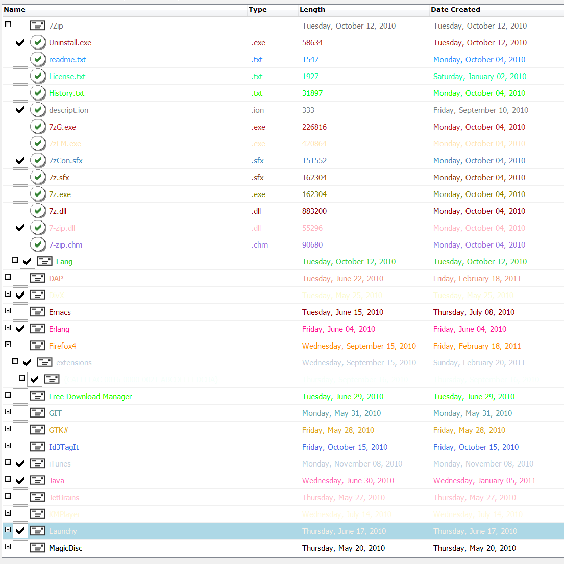
How about a control like that? Isn’t it cool? Unfortunately, you don’t get that with the Windows Forms controls collection. But you can get yourself one; read on.
We might have seen such types of controls and they are called by different names. In the context of the article (and in general I believe), such controls may be classified into two types. This categorization is primarily based on the functionality offered than the view itself. So the two types of the control are as follows:-
- Tree List View (TLV) – A control like the conventional
ListView(in its Details mode), which offers the facility of adding items as child to other items in the control so that a tree structure can be established. The items can be decorated with minor things like check boxes or images. This type of control does not offer the facility of in-place editing. That means it does not offer the facility of popping up a corresponding or associated control with each (sub)item for modifying the value associated with the (sub)item; if the control could be placed in edit mode. - Tree Grid – I believe, by now, you would have understand what this type of control has to offer – everything that the Tree List View does and does not offer. You could compare a tree grid with a conventional data grid, in which elements could be added to establish a tree hierarchy.
So that is a Tree List View control. Let us see how to build one.
Implementation Plan
What we will be doing is derive from the existing ListView class, call it TreeListView. So our Tree List View is basically a control with all the capabilities of the list view and exactly same in its vanilla state. Not only that, we will have to capture the hierarchy information among the list view items. To do that, we will derive from the existing ListViewItem class, call it ListViewItem2. Assuming any instance of ListViewItem2 to be a parent item (at any level), we should be able to add child list view items. In other words, an instance of ListViewItem2 is a container of its child items, and a cue for our custom rendering logic to render it as a hierarchy.
Thus the hierarchy is captured. Rest of it is rendering this hierarchy.
Taking Control Of Rendering
Yes, we will have to take control of the painting logic for such a control. We will set the OwnerDraw to true and override DrawItem and DrawSubItem to implement the custom logic to render appropriately.
There are several things which are part of the rendering logic. Each item in the list view can have a checkbox or an image. We have to show\hide items depending on whether their parent is expanded or collapsed. Besides, it will also show a plus (+) image if it has child items and if it is expanded; or a minus (-) image if it has child items and if it is collapsed. An item with children should expand when clicked on the collapsed (+) image, and collapse when clicked on the expanded (-) minus image. And depending on the depth, the text for the first sub-item of each list view item must be spaced\tabbed accordingly. We should take care of auto adjusting the length of the header item when double clicked on the header seam lines. Our custom logic has to take care of all these things to render.
Code is worth a thousand words. Following is the meat of the rendering logic.
private void OnDrawSubItem(object sender, DrawListViewSubItemEventArgs e)
{
   SuspendLayout();

   var lvItem = e.Item as ListViewItem2;
   if (lvItem == null || lvItem.IsEmpty)
   {
      return;
   }

   var txtMetrics = Helpers.GetTextMetrics(e.Graphics);
   int yFactor = (e.Bounds.Height - txtMetrics.tmHeight) / 2;

   bool hasChildren = lvItem.HasChildren;
   int xBound = e.Bounds.X + 5;

   if (e.SubItem == e.Item.SubItems[0])
   {
      int iLevel = lvItem.GetIndentLevel();
      bool hasParent = lvItem.Parent == null ? false : true;

      xBound += hasParent ? iLevel * 14 : 0;

      if (hasChildren)
      {
         var imageLocation = new Point(xBound, e.Bounds.Y + yFactor + 1);

         lvItem.PlusMinusLocation = imageLocation;

         var image =
         		lvItem.Expanded
         		? TreeListView.MinusImage
         		: TreeListView.PlusImage

         e.Graphics.DrawImage(image, imageLocation);
         xBound += (TreeListView.PlusImage.Width + TreeListView.GeneralGapWidth);
      }

      if (this.CheckBoxes)
      {
				Size cbSize = CalculateCheckBoxSize(e.SubItem);
				Rectangle cbBounds = new Rectangle(new Point(xBound, e.Bounds.Y), cbSize);

				ControlPaint.DrawCheckBox(
					e.Graphics,
					cbBounds,
					(lvItem.Checked ? ButtonState.Checked : ButtonState.Normal) | ButtonState.Flat
				);

         lvItem.CheckBoxBounds = cbBounds;
         xBound += cbBounds.Width + TreeListView.GeneralGapWidth;
      }

      if (this.SmallImageList != null
	      		&& e.Item.ImageIndex >= 0
	      		&& e.Item.ImageIndex < this.SmallImageList.Images.Count)
      {
        Image img = e.Item.ImageList.Images[e.Item.ImageIndex];
        int imageWidth = img.Width;
        int imageHeight = img.Height - 2;

        e.Graphics.DrawImage(img, new Rectangle(xBound, e.Bounds.Y + 1, imageWidth, imageHeight));
        xBound += imageWidth + TreeListView.GeneralGapWidth;
      }
   }

	PointF drawPoint = new PointF(xBound, e.Bounds.Y + yFactor);
	SizeF drawBound = new SizeF(e.Bounds.X + e.Bounds.Width - xBound, e.Bounds.Height);
	RectangleF drawRect = new RectangleF(drawPoint, drawBound);

	StringFormat txtFormat = new StringFormat();
	txtFormat.Trimming = StringTrimming.EllipsisCharacter;
	txtFormat.LineAlignment = ToStringAlignment(e.Header.TextAlign);

  e.Graphics.DrawString(
			e.SubItem.Text,
      e.Item.Font,
      new SolidBrush(e.Item.ForeColor),
      drawRect,
      txtFormat
  );

	ResumeLayout(true);
}
That is it. We got our control working.
Points Of Interest
- This control will work its magic only in the Details view and when the OwnerDraw is set to true. Otherwise, it is nothing more than a normal
ListView. So, for instance, you could switch off the OwnerDraw and show the items flattened out; which was needed in my case then. - As of this writing, column re-ordering is not supported but it is possible to support column re-ordering.
- As of this writing, column resizing is not supported. The column width is sized to fit the longest content. The resizing can be enabled from code by modifying the
OnColumnWidthChangingevent handler. However, the ‘size to fit content’ resizing (double clicking on the column header border) can not be achieved because the control fires the ColumnWidthChanging event both when resizing by dragging the column header or double clicking the column header border. Since the distinction cannot be made, it is not possible to programmatically set the column width.
History
- Oct 1, 2014 – First Draft